
My son Ethan was 18-months old when he had his first daycare summer break. It was my first summer break as a mum, and I was as excited as a child. I took time off work and was set on making the summer exciting, inspiring, and educational for both of us. I made a decision to be as data-informed as I could, which meant collecting data. I believe that collecting data about Ethan’s interests and activities helps me be a better-engaged mum and gain a wider perspective. So, I decided to record all his activities, the time spent on each one, and with whom, thinking this would teach me to set goals and plan suitable activities for his needs.
In the weeks leading to Ethan’s summer break, I began working on an extensive Excel sheet, scheduling activities, playdates, and goals for the summer. Our days were filled with sensory activities, playing with toys, reading books, and exploring the great outdoors. To me, data is a vital component of our experiences. It adds a layer of information that is not visible to the participant or the observer. Yet, it must not interfere with the activity or shift the experience. Initially, I planned to record the time spent on each activity. I thought the timing layer would help me understand Ethan’s favourites. I discovered that creating timestamps in Excel consumed my focus and made me too aware of time instead of delving into the fun, so I removed the time column from my data sheet.

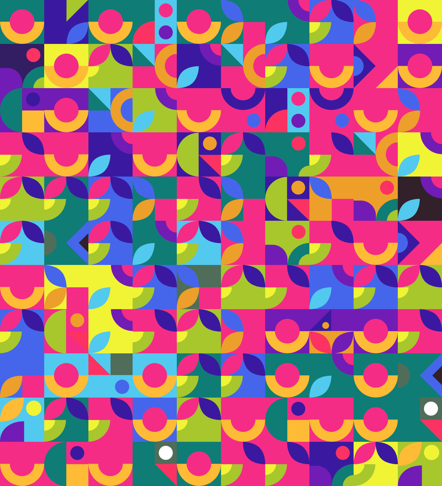
After a few days of data collection, I had an impressive log of 20 entries with various activities. It was time to create a visual representation of each activity.
First, I set the colour palette. I had 12 different groups of people that Ethan spent time with. For example – grandad, granny, mummy, and daddy were one group, and grandad, granny, and mummy were another. I wanted to reflect the enthusiasm I felt for that summer in the colours: Flickr pink, pine green, neon yellow, and majestic lavender. I limited my palette to12 colours to represent all the data, background, and symbols.

Once I had the colour set, I opened my Adobe Illustrator and started doodling a symbol for each activity. Since I planned to publish my final piece on Instagram, I set a square to represent each entry so the pattern created could be displayed entirely under Instagram restrictions. I designed the symbols to touch the edges because I wanted to create a seamless effect. Additionally, I wanted the background colour, the layer with whom Ethan did the activity, to submerge into the symbol to represent that activities differed based on the participants. For example, if my husband joined Ethan and me to go to the beach, it would be an entirely different experience than without him.

I presented the pattern of Ethan’s summer 2022 activities and playdates with vivid colours. My dad helped me set up SQL to generate it automatically. This was my summer activity with him! Even though it was a self-data collection, I submitted my design to the “Information is Beautiful” award and made it to the longlist! See the full project on my Instagram account.
I cherish the opportunity I had to spend time with Ethan and set activities for him to grow and evolve. I am also grateful for the insight this activity afforded me to learn more about my toddler and his favourite activities. I wonder if, as time passes, we will still like to do the same things together.

Or is a critical thinker and an enthusiastic data-visualisation designer who finds patterns in everyday life and transforms them into clear, meaningful visual stories. She previously lead the UX & Data Visualisation within the Business Intelligence department at IEC. She just started a practice-based PhD exploring how data visualisation can support more balanced decision-making for people living with diabetes.
- Or Misgav

- Or Misgav

- Or Misgav

- Or Misgav


