
One evening, while scrolling endlessly on my phone, an advert caught my attention: “Pride of Portsmouth” trail. Immediately, my mind shifted from passive to data mode. Could I use a three-dimensional canvas to advocate for data art? Could I use this opportunity to create a data viz love letter for my city?
Launced on July 13, 2026, as part of the Portsmouth 100 celebration, Pride of Portsmouth is more than an art trail. It is a celebration of the city’s identity, creativity and community. Across Portsmouth, 45 lion sculptures will roar for the city. Each is designed by an artist who brings a different story, perspective and style. Artists were carefully shortlisted and selected by sponsors, helping to create a diverse and inspiring collection.
Each lion is a fiberglass-moulded sculpture, measuring approximately 100 cm in height, 175 cm in length, and 60 cm in width, designed to captivate the eye. For me, it was the largest canvas I had worked with in recent years.

Every story begins with data. To create data art on that powerful of a scale, I had to find the right data source. I spent endless hours exploring datasets from the Office for National Statistics (ONS). Once I discovered the pre-made tables of the 2021 census (the last completed census), I struggled to pick just one story. How can you decide between stories about ethnicity, family history, religion, health, and employment?
Rather than reduce the city to a single narrative, I decided to weave two distinct datasets across the lion itself. The left side of the lion is cross-referenced to health status, religion, and age group. The right side maps the employment rate by age and gender. I must say, it was encouraging to see that the majority of the local population was employed at a high rate. Also, the data revealed a striking pattern: the vast majority of Portsmouth residents claimed no religion, with Christianity being the largest religious group, followed by Muslim. The remaining religious categories fell below my standardized factor threshold, combining for fewer than 15 spots total.

Data visualization by: Or Misgav
After immersing myself deeply in the data, I faced the thrilling challenge of building the colour palette. Right when I was about to hit “click” and add another variable to my library on Figma, my project sponsor Lakeside North Harbour invited me to bond the lion to its patron and anchor the visual identity by adding their primary brand colour. My heart skipped a beat at the concept. To make the connection feel completely organic, I used their colour to embody “Good Health Status.” To me, it feels like a poetic alignment, celebrating the wonderful reality that the vast majority of our population thrives in good health.
Source: Office of National Statistics
Data visualization by: Or Misgav
Determining the overall palette and the stacked layer’s data took over 4 hours of intense iteration. I went back and forth — adjusting the visual weight of the attributes to determine which portions belonged to the outer perimeter, the inner core, or the splits across halves and quarters of the circles. The results reflect the storytelling I was trying to share: how to read the data, from the big to the small. No numbers, pure visual language.
Lately, I have been drawn to circles as a primary data element. Beyond their resemblance to pie charts, circles’ capacity to hold multiple definitions and overlapping narratives fascinates me.

Data visualization by: Or Misgav
The first night before painting began, I spent more time staring at the ceiling rather than sleeping. Counting all the things that could go wrong. For me, the digital distance and the perfection that the auto-alignment frame provides are the core of my aesthetic beliefs. How can I hold SHIFT on the lion and measure the correct distance between the circles?
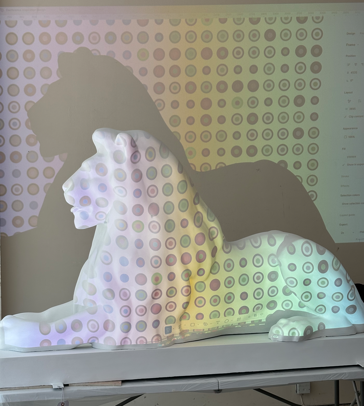
Initially, I tried using a digital projector to cast the grid directly onto the sculpture and to adjust the spot diameters on the go. However, the projector’s vertical angle distorted the margins and threw off the row spacing entirely. More importantly, the projected pattern looked completely flat, utterly ignoring the lion’s natural 3D contours. I tried different heights and sizes, marking spots on the lion with a washable pen over and over, until it was covered with too many dots to make anything out. It did not look good. I was unhappy. Translating a flat, pixel-perfect Figma grid onto a curved, three-dimensional sculpture was where my digital perfection collapsed.

The next day, as I was riding the double-decker bus to university during rush hour, a pattern of cars emerged in front of me. I realised that the cars in traffic are creating a “brick-wall pattern”. Aha moment. A breakthrough. If I transform my Figma auto-layout grid into a honeycomb pattern and space the circles slightly farther apart, the design could actually breathe. It could celebrate the lion’s curveiness. With my husband’s help, using a ruler and a light paper as a flexible material (which naturally hugged the lion’s curves), we manually plotted the centre of every circle — all 1,500 of them.
There are many “rules” for conducting data visualization. I usually ground my own practice in Alberto Cairo’s five foundational pillars, which emphasize that (for me, above all) a visualization must be truthful to the data. Truthfulness meant that every single drop of paint had to be calculated, measured, and strategically placed. By attempting to avoid miscounting data points, I had to constantly reread my tables, plus I had to count every single spot out loud as I placed it, to remember the correct number. This became an exercise in extreme focus, given that I was working in a communal studio surrounded by brilliant and incredibly chatty artists.

By the time I had painted my 100th circle, I understood for the first time the magnitude of the project. It took me by surprise how much time I spent on just the groundwork, not the actual painting. Realising I needed to optimise my process to meet the deadline, I stayed up that night to build a Gantt chart. Mapping out milestones that tightly gridded my PhD workload, family commitments, and professional schedule. Running? Weekends? Seeing friends? All of it went out the window.

Painting the lion was exciting and exhausting. There were days that all I could say to myself was: Whatever doesn’t kill you makes you stronger. Days when I, for the first time in years, understood what my undergrad professors preached about the “messiness” of manual labour and the need to add an “artistic touch.” Days that my fingers were constantly stained with paint, nights that spots and circles daunted my dreams.

Moving from the screen to the physical world was terrifying. I learned how spoiled I was by the safety net of CTRL+Z and the ability to hold SHIFT to snap to flawless grids and patterns. With the click of a button, I could change all the colours on the canvas. But in reality, I had to re-paint several coats to change from dark green to light green.
Taking on this challenge was exhausting, but deeply rewarding. Partly because it became a collaborative triumph, surrounded by kind people. A friend stepped in to assist for a few hours, my husband and children pitched in around the clock, and the Pride of Portsmouth project manager provided incredible support.
And after four intense and brutal weeks of working every single day, the lion was done.

Ultimately, the project forced me to rethink my approach to data presentation. I realized that the true value of data art isn’t the sterile perfection of a digital grid; it’s the messy (intentional to some extent), deeply human aesthetic presentation of the information.

By stripping away the numbers and letting the raw circles speak for themselves, the lion invites the public to play data detective. It is a complex piece, undoubtedly, perhaps a tad heavy on the cognitive load, but it’s an open invitation for Portsmouth to discover the pattern and to see this lovely city exactly the way I see it every day.

Would I have done things differently, with the knowledge and experience I have today? No doubt. Would I reapply to this project given another opportunity? YES! Where do I sign up?


Or is a critical thinker and an enthusiastic data-visualisation designer who finds patterns in everyday life and transforms them into clear, meaningful visual stories. She previously lead the UX & Data Visualisation within the Business Intelligence department at IEC. She just started a practice-based PhD exploring how data visualisation can support more balanced decision-making for people living with diabetes.
- Or Misgav

- Or Misgav

- Or Misgav

- Or Misgav


