
There are many remarkable people who are committed to making data visualizations more accessible to visually impaired audiences. Nightingale chatted with two of these individuals to get their take on the milestones—and challenges— they see in their everyday practice. The conversation that follows has been edited for brevity and clarity.
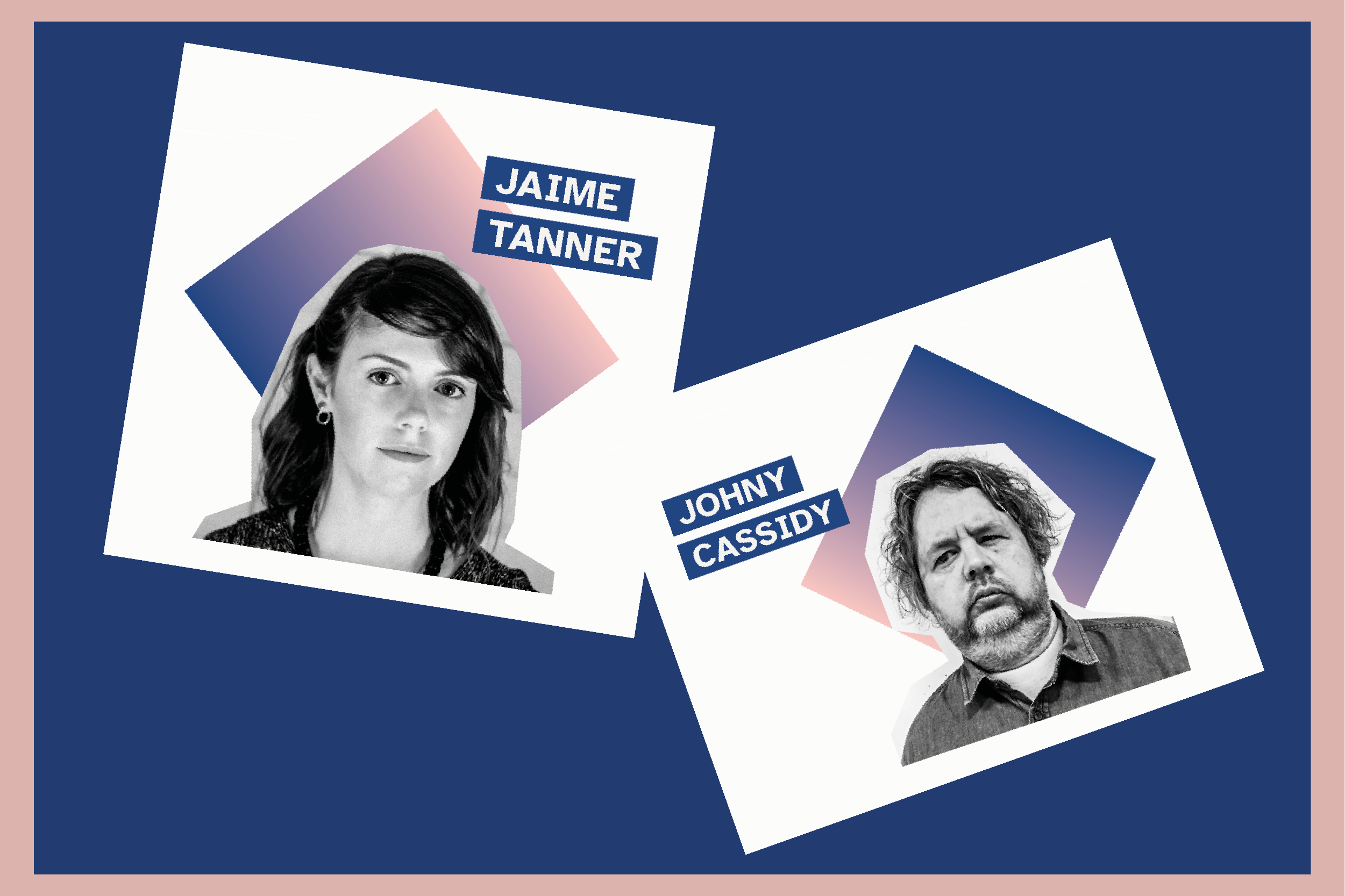
Jaime Tanner: Information designer and developer who became the first accessibility visuals editor at The New York Times last year.
Johny Cassidy: BBC journalist who recently pivoted his career to focus on making visual data journalism more accessible. He is also registered blind and relies on screen readers.
Is the data viz world ready to embrace accessibility?
Johny: I would argue, and I have argued, that data viz is an accessibility tool in itself. Creating visual data is taking raw datasets that normal people wouldn’t really understand—those raw data sets are just numbers, numbers, numbers—and making it into something that’s accessible, for want of a better word, because the human brain is made to look for patterns. So it’s not really a massive leap, then, if you do understand and agree that data viz is an accessibility tool, to go one step beyond and make it accessible for everybody.
Jaime: Agreed. If you’re working in this field, then you probably got into it with the desire to help people to understand the world, to see the forest from the trees, or to envision something that might otherwise be difficult to imagine. To realize that, in fact, the data viz that you created to make information more accessible might have actually created a barrier to access for many disabled readers—I think that revelation is jarring. So I do feel many are eager to learn more and to think about what they can do to make their work more accessible.
Johny: I think in theory, they are. Everybody’s up against time and resource issues. So although there is an understanding of why it should be done, the fact that the processes aren’t as easy as they could be to make that happen is also jarring.
Jaime: Yeah, I do think that’s the reality. It’s a big shift in every step of the process. There are technical challenges. There are new skills to learn. And, of course, many are unaware that there is a gap to bridge.
Tell us about the progress you’ve seen and whether you’ve noticed tendencies to backslide.
Johny: Something that I’ve seen a lot more is the “shift left” practice, to get accessibility provisions baked in from the start, so you’re not trying to retrofit at the end, which causes everybody headaches. Having people with an understanding, experience, awareness, and willingness to be the person in the room to say, “Okay, this sounds really good, but what about the folks who need accessibility provisions”—that’s becoming more and more prevalent in a lot of the work that I’m seeing.
“Something that I’ve seen a lot more is the ‘shift left’ practice, to get accessibility provisions baked in from the start, so you’re not trying to retrofit at the end, which causes everybody headaches.”
Jaime: The challenge is to make processes sustainable, so that accessibility is something we’re considering every single time we make a product or graphic. When you are working on something pressing that needs to be completed today, you have to make decisions that allow information to get out quickly. You need to be able to fall back on a workflow that ensures the accessibility of your piece doesn’t fall by the wayside. So much of that, in my opinion, comes down to making this work a part of your practice. If you regularly make sure to include text descriptions, or alt text, in the data viz that you create, for example, the work becomes much easier. You know how to add it to your projects, you have practice writing it—all of that helps to make it an essential part of your work, even on a deadline.
Johny: Right, and I think that became really, really obvious and prevalent during the pandemic. A lot of big organizations and news broadcasters use data viz, and they can do accessibility stuff day in and day out, but when the sh*t hit the fan, accessibility was the first thing that was dumped because things had to be done so quick, the COVID dashboards had to be done so quick. I did research at Oxford University that showed that accessibility was not in the forefront of people’s minds when they were trying to get out that vital, crucial information. So you can really see the gap in that time-pressured workflow and how it was being considered. So, I think—I would hope—that there’s going to be lessons learned from that.
What’s driving the change to consider—and practice—accessibility?
Jaime: It’s an interesting question, what has sparked the change. There are more folks in the data viz community talking about accessibility and sharing examples of what’s possible. It’s perhaps hard to understand how far behind you are until you get an example of what an accessible graphic could be. Once you acknowledge that there is a gap, it’s hard to ignore it.
“It’s perhaps hard to understand how far behind you are until you get an example of what an accessible graphic could be. Once you acknowledge that there is a gap, it’s hard to ignore it.”
Johny: In fact, I think it’s something a lot more simple: It comes down to the proliferation of competition. It’s a cold, hard business case. When there are so many different publications fighting for eyeballs, fighting for readers, and fighting for viewers, there’s a case to say, okay, we are actually going to make a big commitment to serve audiences that perhaps haven’t been served as well as they could have been in the past. Steve Jobs and Tim Cook did this with the iPhone at Apple. They were the first to provide VoiceOver [Apple’s built-in screen reader], and that baked accessibility into a phone operating system from the outset. And it wasn’t really because they were nice guys. It was because they saw that cold, hard business opportunity to find a market that hadn’t been served. It created brand loyalty, and I think there’s something similar happening now. At the BBC, the way the funding model is, we have to have value for all, and there are a lot of disabled people that pay the license fee and you can’t forget about them.
It also comes down to diversity and inclusion. You know, a lot of really good thought leaders understand why it’s vital to not just be taking from the same pool all the time. If you want to revitalize your workforce, you have to have people from different backgrounds, different experiences—and that’s including disability. Disabled people might have been invisible in the workplace before. As people become more aware of colleagues around them, it becomes normalized. And when people with different accessibility needs are more visible in society, then they’re more forefront in people’s minds when they’re designing and building products.
Based on your experience helping others integrate visual accessibility into their work, what is your advice to people who need some guidance?
Jaime: Learn how to use VoiceOver, and open up a few projects that you like in a web browser, and you’ll hear immediately what information you’re not getting and what kind of artifacts are announced that you don’t necessarily need. Hearing it yourself—it’s immediately impactful.
Also, get over the fear of doing it wrong. I have this sign on my desk that says, “Do it badly,” which is just a little reminder to myself to get out of my own way and try something. Every time you’re able to take even one step towards a more accessible solution, you’ve made something that is more inclusive—the work that you did is something that you can improve on and learn from, and that over time can become a part of your practice.
Johny: I would say, don’t be afraid to reach out and ask people who have experience. You know, not long ago I was very new to the whole community of data viz practitioners and people that were working on accessibility. And what I found is that it’s a really welcoming, inviting, supportive community. And everybody is there for the same reasons, wanting to push for the same goals, and making things a lot more accessible.
This article originally appeared in Issue 3 of Nightingale magazine. Get your copy here!
Looking to make your data visualizations more accessible? Check out our resources page!
Nightingale Editors
Our Nightingale editorial team currently consists of Alejandra Arevalo, Brian Cort, and Teo Popescu. Reach us at Nightingale(at)Datavisualizationsociety.org
- Nightingale Editors

- Nightingale Editors

- Nightingale Editors

- Nightingale Editors


