
In July 2021, I joined the DVS Board as the Education Director. Since then, I’ve been doing some initial research to get clear on what “education” really means in a society of dataviz practitioners.
Defining education
While I don’t have any definite answers yet about what education means, after looking at our member data, I do have several hypotheses. I’ll share some of the data that informed this approach below, but first, let’s take a look at the punchline.
Here is what I think education means for our community right now:
- Share practices and resources, and build a community to support the exchange of ideas across the many, varied facets of this field.
- Identify your own learning journey, no matter where you’re starting from. It doesn’t matter if you’ve been in the field for 20 days or 20 years: there will always be more to learn. (Isn’t that exciting?)
- Embrace a spirit of discovery, and use it to improve your day-to-day practice…starting from wherever you are right now. Let go of perfectionism and realize that there is no “enough” — there will always be room to improve, iterate and change, and new perspectives to consider.
- Practice humility. Realize that no one has all of the answers (if truly panoptic answers even exist). Even the “experts” have just as many learning opportunities as a newbie, and someone who’s just starting out in dataviz might have 30 years of experience in something else. It’s the journey itself that creates expertise, and we all have the same amount of work to do.
- Share your practices, frustrations, and struggles to help others who might be following a similar path along the same path.
- Celebrate the wins. This climb can be a hard one and sometimes we need to be reminded that this is also an incredibly rewarding path to pursue.
- Build community. Like any journey, learning is best done in company. We grow further, stronger, and faster when we have peers to push our edges, hold us to high standards, and to urge us on.
Operationalizing the information
Once we have a picture of what education means, the next question is: how do we create resources for education in this context? That’s going to take more than one article to think through, but for now, this is where we’re looking to head:
- Focus on building practical skills. Whether you’re starting out or learning something new, getting your hands dirty is usually the best way to learn. We’re looking into ways to support members in learning new things, and in putting that knowledge to work, right away.
- Connect to the community. Community is core to the DVS mission and is something that can be hard to find when you’re working in a new field, especially one that is this broadly defined. We believe that our community differentiates us, and we see our role as facilitators of a thriving online discussion to define and practice better data viz.
- Recognize member achievements. Spotlighting our members and sharing your work is one of the highest priorities for the team. We are working to create mechanisms for people in the community to share their skills and accomplishments for others to learn from and celebrate.
- Support career planning. This initial exploration demonstrates that we have access to member-created data that could help people to navigate and understand the field. I’ll be focusing heavily on this for the next few months, to sketch out ways that we can use this data to help our members build a map of the field. It’s not comprehensive by any means, but I think this is a key value that we can provide.
- Build learning pathways. The education committee is already starting to explore what learning materials might look like in the context of the DVS, especially for more specialized topics where our members might want to build experience. I suspect that much of this will be a longer-term effort, but we’re actively looking at ways to build materials and resources that support individual learning, as well as curriculum-building for more formal education opportunities.
And now, for those who are interested, let’s take a deeper look at the nitty gritty of the data and understand a bit more about how we arrived at these priorities.
Know your audience
My first step in any project is always getting clear on my audience and purpose. I’ve been digging into data from last year’s DVS Census to glean insights about some basic attributes of our community. (The DVS Census is now called the State of the Industry Survey (SOTI), and the deadline has just been extended! Please be sure to fill it out, if you haven’t already.)
First, a few notes on the data:
- This data is now a year old. Things may have changed, but I’m assuming that the overall distribution probably hasn’t shifted all that much in a year. We’ll find out if that’s true after the new survey closes — please stand and be counted, if you haven’t already!
- Privacy is important to us. This analysis is not possible with the anonymized survey data that we release as part of the annual census visualization challenge. In that dataset, all connections between personally identifiable information and survey responses are removed, to protect the privacy of our respondents. During the analysis, I focused only on extracting aggregate values that reflect the community, and not on identifying any individual member or specific response groups.
- Members vs. non-members. I have not done any analysis to differentiate members from non-members. We also can’t know who chose not to respond to the survey, or why, so there may be people in our audience whose opinions were not captured. That said, for the purposes of this article, I will use “audience” and “respondents” interchangeably.
- This is a preliminary analysis. Right now, I am focusing most on rudimentary binning and simple counts. It’s possible that the data will shift with a deeper analysis and more thorough cleaning, but this is what I’m seeing right now.
Engagement in dataviz
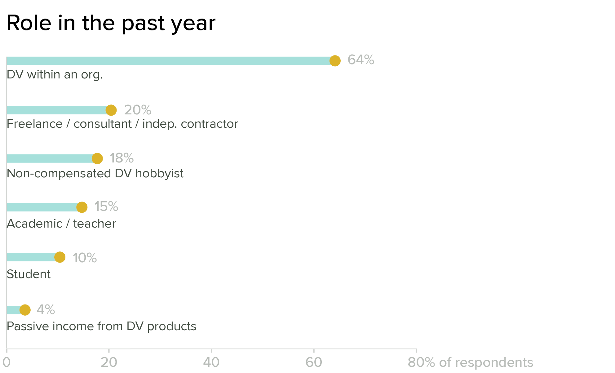
The Annual Data Visualization Community Survey for 2020 was open to anyone who identified themselves as working in dataviz, and we strongly encouraged responses outside of our core member group. Of the 1,766 people who completed the survey, most (64 percent) are professionals working in organizations, but there are strong populations of freelancers, academics, and hobbyists as well. Note that the categories on this question are not exclusive, so one person may be counted in several bars in the chart.
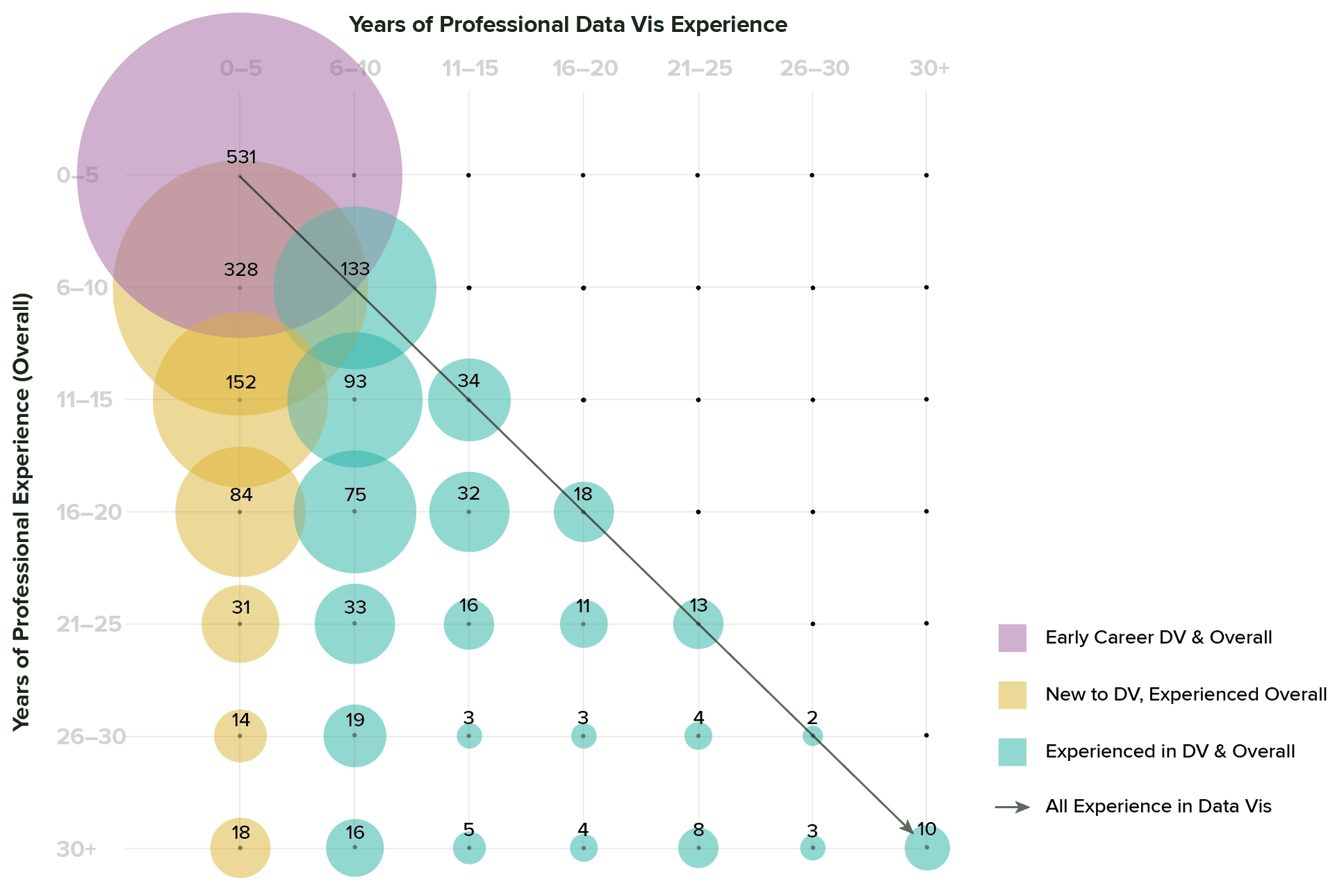
Years of professional experience
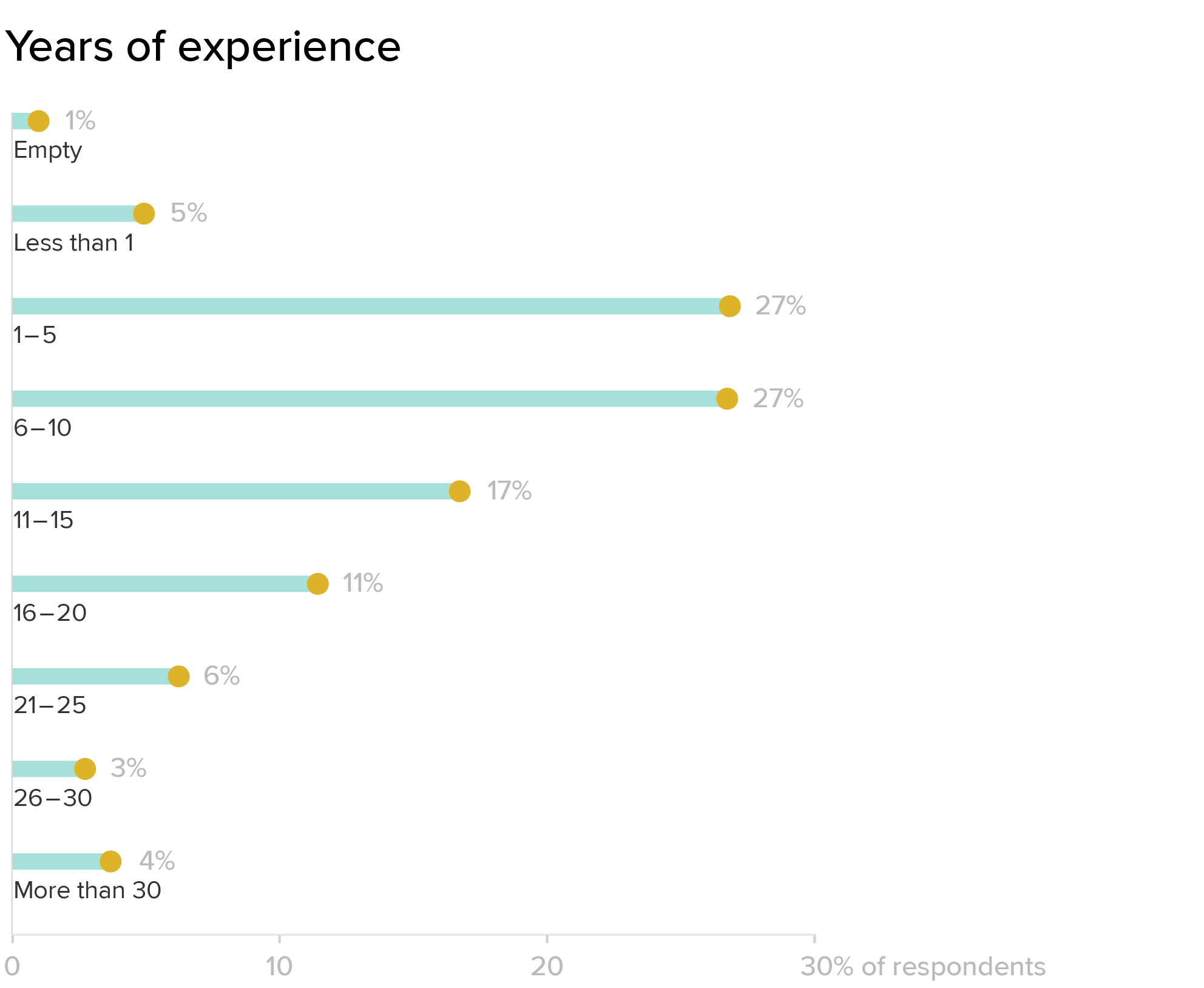
Combined, we have a lot of experience in this community. Looking at overall professional experience, about a third of our audience is in the early career bracket (1-5 years), another third in the 6-10 year range, and the other third distributed between complete beginners and some very experienced folks.
If you compare this data with answers to a second question about experience specific to dataviz, some interesting additional trends emerge.
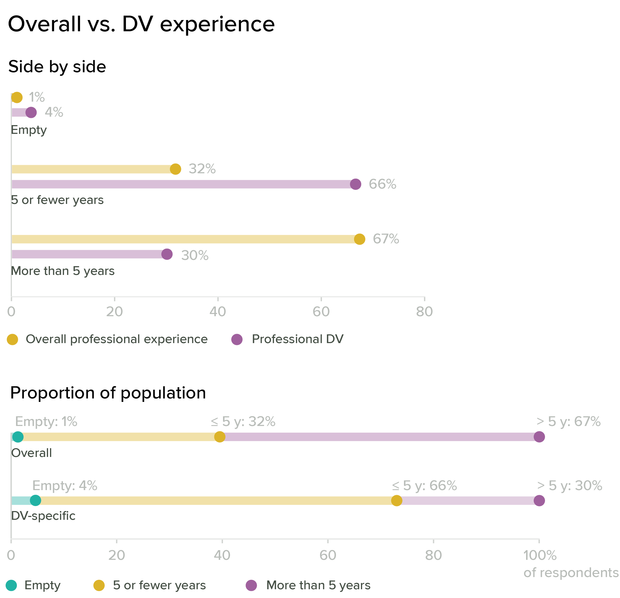
Here, I’m binning all of the data into fewer than five years and more than five years of experience, and the values for general years of experience and dataviz experience are almost perfectly reversed. About ⅔ of the respondents have more than five years of professional experience, but about a third are new to dataviz. This seems to suggest that a lot of people are learning dataviz on the fly, possibly as part of career advancement or changing job descriptions. Overall, more than 50 percent of our audience counts as “early career” when it comes to dataviz.
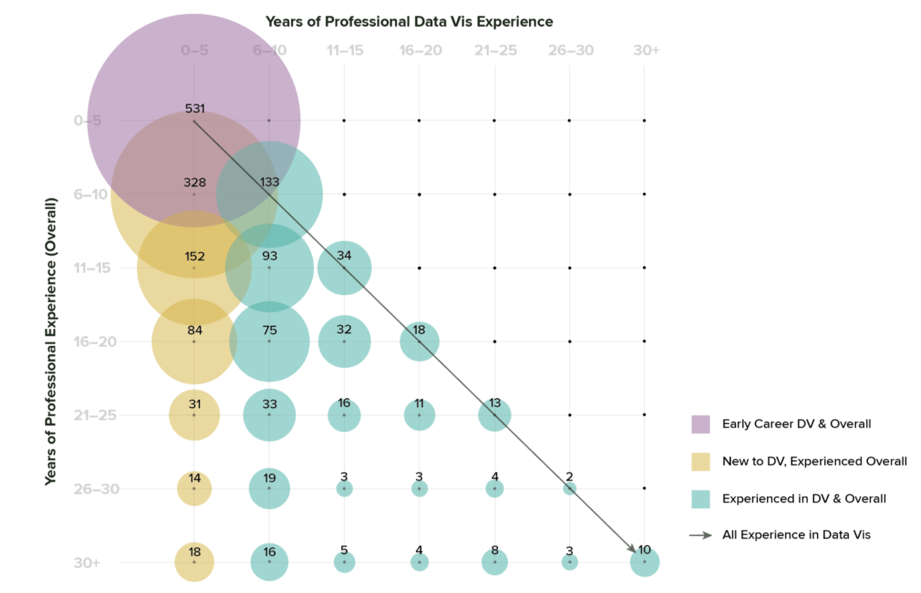
In the previous charts, I aggregated years of experience and years of professional dataviz experience separately, so that neither set of answers informs the other. Each series adds up to 1,766 total respondents, but we don’t distinguish who is in each category: a single person could be in the “more than 5” bar for overall experience, and in the “5 or fewer” category for dataviz. If we cut the data a different way, it’s possible to tease out the relationships between years of experience overall and years of professional dataviz. This cut of the data shows groups who have a lot of experience but are also new to dataviz, groups who have been in dataviz all along, and groups who are new to both professional work in general and to dataviz in particular. To me, this indicates that we likely have multiple populations with distinctly different needs.
Level of education
In general, we’re a pretty educated crowd: almost 50 percent of survey respondents have a Master’s or other advanced degree, compared with 30 percent with a Bachelor’s, and 14 percent with a PhD. This suggests that most of our audience is pretty comfortable with formal education methods, and also that there might be an opportunity for outreach outside of traditionally-educated groups.
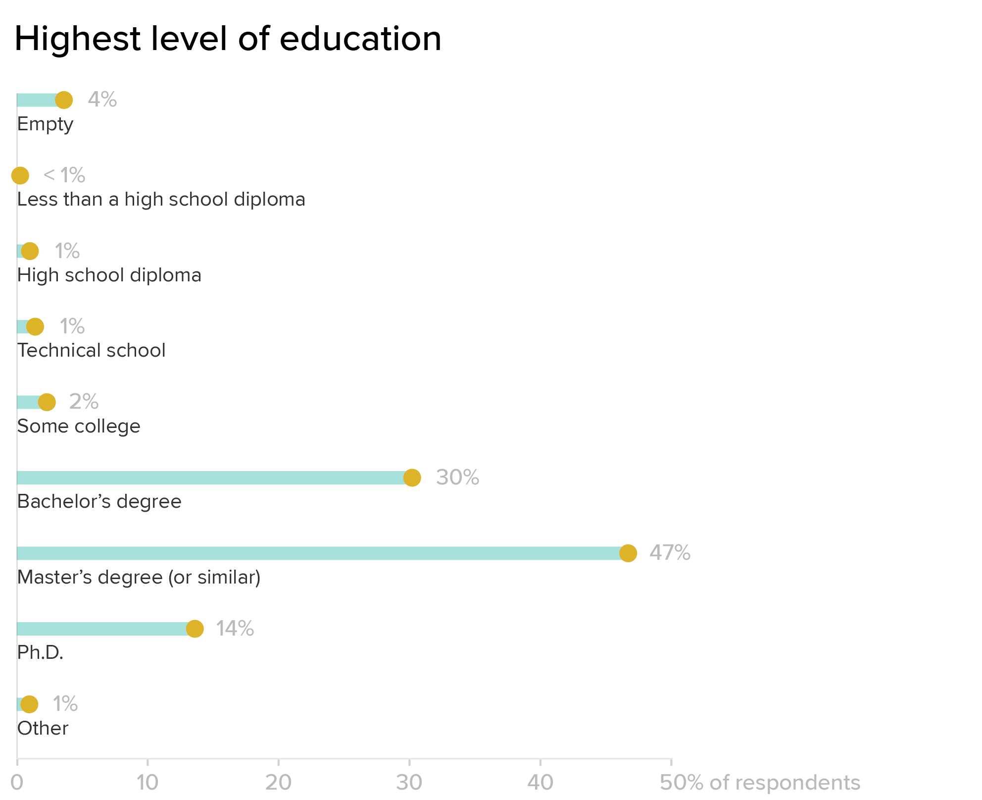
It’s worth remembering that survey data is always an imperfect picture — outcomes are dictated by the population who chooses to respond. All respondents are self-selected, so the data does not reflect everyone: it only shows us who was motivated enough to fill out the form. Anytime the response data is this different from the general population, it’s worth some additional scrutiny. There may be many people with fewer years of formal education working in dataviz who are simply outside of the reach of our survey (and if that’s the case, we should figure out why!). I suspect that this chart in particular might change significantly as we broaden our audience outside of the U.S., because other countries have very different approaches to education and professional qualification.
As an organization, we want to welcome people from all backgrounds, and we don’t believe that formal education is a necessary prerequisite for doing good dataviz. From a diversity perspective, it’s also worth asking whether the way we present ourselves as a society is more welcoming to certain groups, and how we might become more accessible to people outside of that space.
Educational background
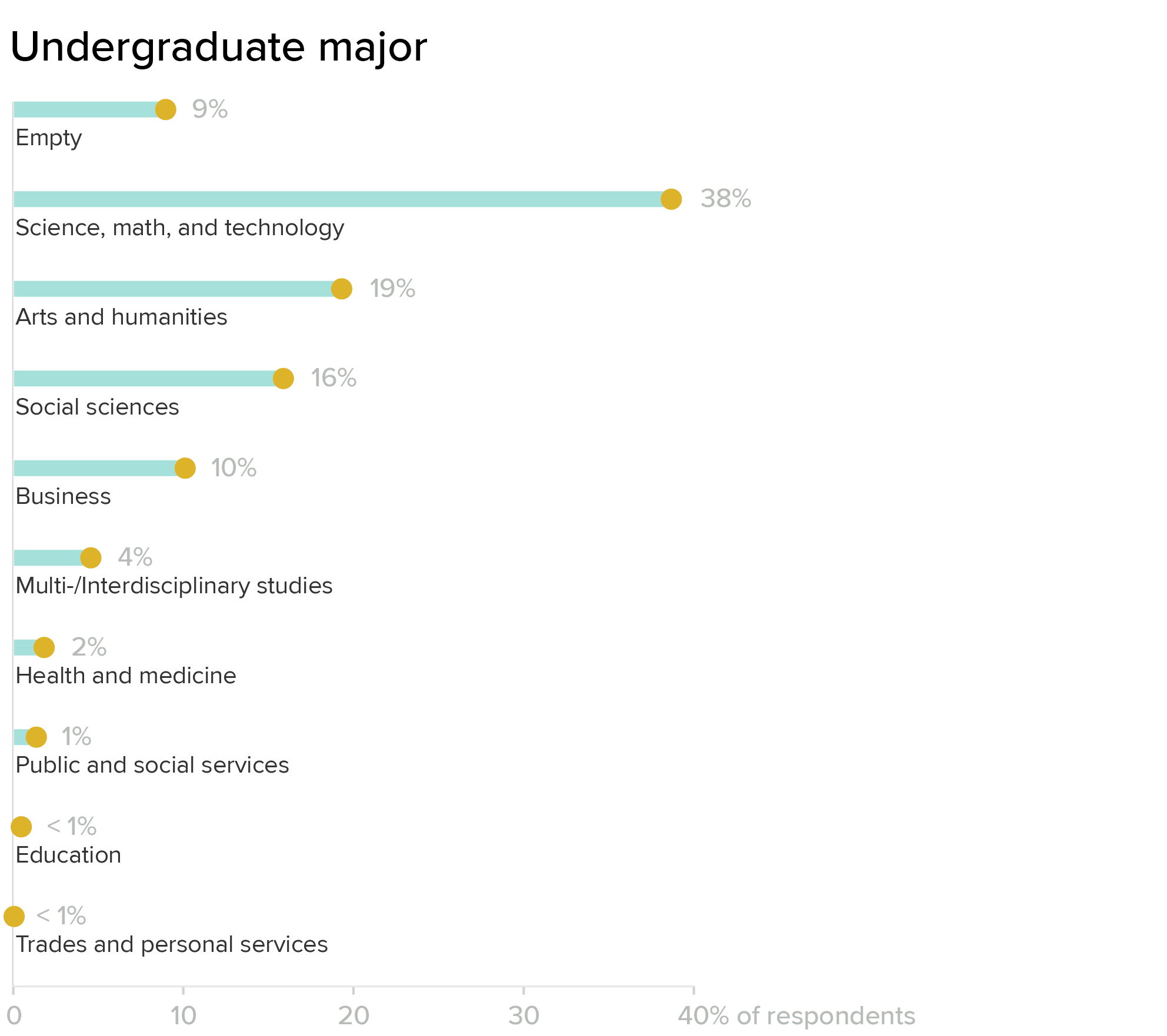
Our survey population skews heavily scientific: most respondents who went to college majored in science, math, or technology. Public services, health and medicine, and social sciences are smaller groups at the moment, but seem like they might be natural areas of expansion and outreach to new audiences, as well.
Learning method
Even though many respondents have higher degrees, most consider themselves to be self-taught. This likely reflects the practical, hands-on nature of dataviz — it is often something that you learn as part of the long apprenticeship of scientific or academic research, or on the job in a more applied role. Considering the high level of education in the previous charts, I read that “mostly self taught” category as indicating a lack of explicit emphasis on dataviz in the curriculum (at least while our current respondents were in school).

Distribution of titles
In addition to reading out raw values from the dataset, I experimented a bit with manual tagging, as well. I wanted to pull out information about the different job sectors that people work in, and made some educated guesses based on the job titles included in the non-anonymized survey data. Again, this analysis is only possible to internal DVS staff, and cannot be reconstructed from the publicly-available dataset. These results are based on my best guess for what individual job titles mean, so they are highly subjective and should only be considered preliminary. That said, I think that they offer an interesting view into how our membership is distributed.
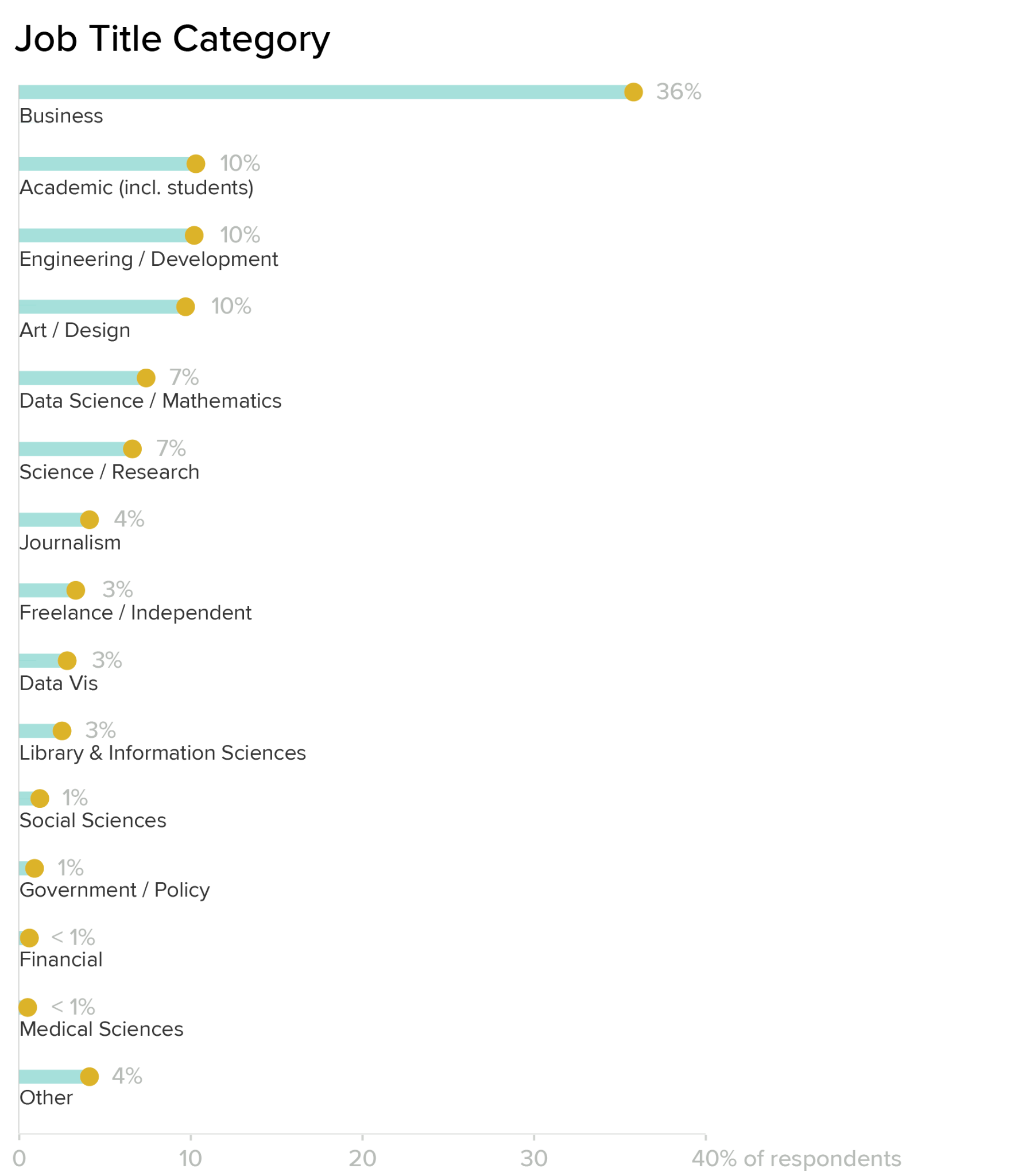
Based on raw counts alone, roles that I tagged as a “business” category are by far the largest group. This group is made up of mostly analysts, but includes executive and management roles as well. Development and engineering jobs come next, with art/design and academic roles (including students and fellows) at roughly the same level. Overall, the business sector makes up about a third of our audience. Another third is split pretty evenly between the next three categories: engineering/development, art/design, and academic roles. Adding in the applied sciences, math/data science, and journalism gets us to about 80 percent, with the remaining 20 percent split into smaller groups.
Dataviz is often added as a modifier on top of other roles, rather than used as a title by itself. This is reflected in the fact that specialized dataviz titles (ones that were not already specified into any of the other categories) are all the way down in the miscellaneous section near the end, making up only about 2.8 percent of survey respondents. My own title of Data Visualization Designer would be classified in Design according to these (mostly arbitrary) sorting rules. The results from this year’s survey should be much less ambiguous: you’ll note that there’s a dropdown option to select your sector along with the text entry field for the actual title — it’s much better to have you tell us where you think you fall, than to have me trying to guess later based on title alone! I’m hoping this will help us to understand more about the emphasis of dataviz within these different roles.
Takeaways
The data confirmed several guesses and assumptions that I’d made, and pointed out other things that surprised me. I came to this position with a lot of experience in formal education. I have a PhD in chemistry, taught over 1,500 students throughout graduate school, and served as a tenure-track professor for a few years, before deciding that academia wasn’t the right career path for me. When I left my teaching position, I went back to school for a master’s in Information Design and Visualization, and spent two years learning the techniques and practice of design. This option is not practical for everybody, but for me it was the fastest way to build my portfolio and reset my career, and it has served me very well.
Coming into this position and hearing about previous initiatives in this space, I was approaching the task of the education committee as connecting into academia and helping to develop curriculum and standards for dataviz. Looking at the data, I actually see a much stronger applied focus in our audience, and significant learning on the job. To me, this changes our approach to delivery, structure, and content for educational resources that we might compile. I still think that connecting into academia is an important and laudable goal, and ultimately, I believe that we need to do both. But this data does shift the emphasis and the specifics a bit for me, especially in the short term.
The other major item of interest in this data is the distribution of experience, and the sheer number of people who are quite new to dataviz. Most professional societies (at least in the US) are created by experts, for experts, and serve primarily as a place to publish your work and push the edges of the field. They may be more or less open to hobbyists and newcomers, but the focus is usually on the presentation of top-quality professional work. In many cases membership in those organizations becomes part of the professional standard for the field, and they may even play a role in setting professional and accreditation standards for educational programs and schools. But is that who we want to be? These first observations about our audience also led me to ask some deeper questions about purpose, and what we’re trying to achieve.
Understand your purpose
I asked my fellow board members to fill out a survey to help me understand where we might want to go as an organization. The survey presented board members with a 1-10 scale between two extremes, and asked them to indicate where they thought the DVS should be along that scale. Some options are a bit provocative, or set up an either/or for something that we know is multidimensional. That was intentional, to help me separate the multiple, intersecting axes.
Creating and aggregating content
The first survey question was about aggregating content versus producing it ourselves. (Data is shown as counts, where one dot is one board member who responded to the survey.)
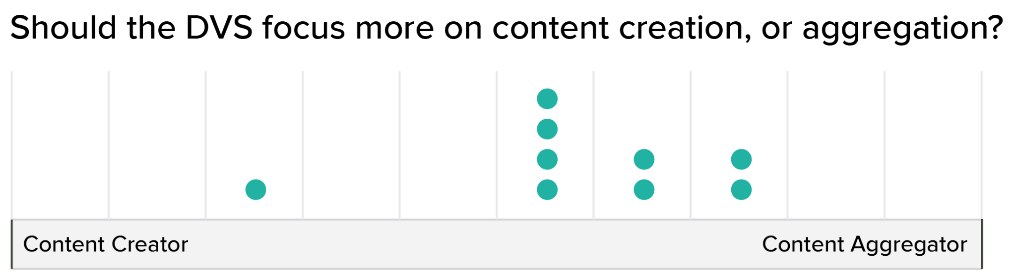
In general, we want to aggregate high-quality content and to direct people to resources that are already available in the community. There will always be times that you need to create something that doesn’t exist yet, but in general we’d prefer to focus on connecting people to existing resources rather than creating our own.
The distribution was a bit wider when talking about whether we should be responsible for curating a collection of high-quality materials (establishing the “canon” of works for dataviz), versus being a space where the community builds resources and materials for themselves.
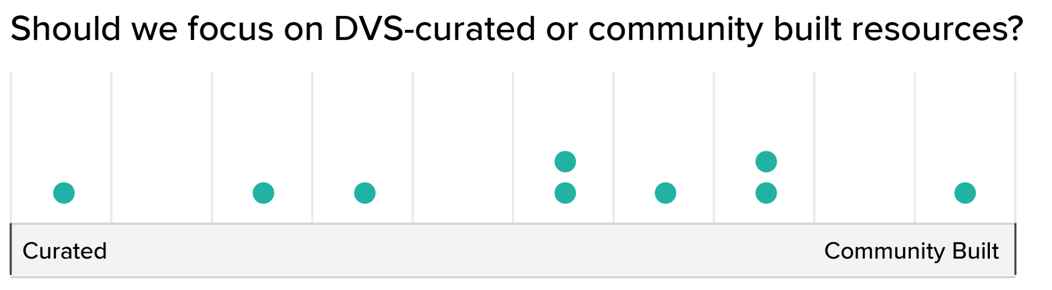
Most of us fell somewhere in the middle on this one, but there were opinions across the entire range. I suspect that this reflects the variety of contexts where the DVS operates, and that the answer may be different for each one (education materials may need to be more curated than Slack channels, for instance). When discussing this individually with multiple board members, what I heard is that we do think that there is some need for curation, but don’t want to be too heavy-handed in deciding what’s in or out. We’d prefer for knowledge to be built by the community, and then vetted for quality in collaboration with our members. At the end of the day, we believe that it is the community who will determine what belongs to the field.
The next question focused on what kind of content we are looking to accumulate. On one end of the spectrum, we could collect anything that’s interesting, regardless of quality or authority in the field. On the other end, we could select only the most authoritative works to curate and showcase. (I think of this as the spectrum between Reddit and a high-end art gallery in New York.)
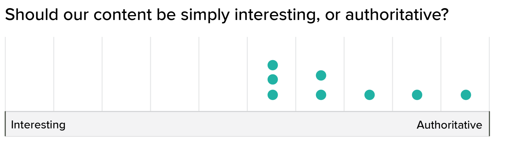
This result chart is particularly interesting. We’re firmly on the quality side of the spectrum, but weighted more toward the middle than the top. What that means to me is that we want some threshold for quality and relevance, but that we’d prefer to keep the filters open, and include things that are edgier, more speculative, or that have not yet gained enough social currency to be considered “established” in the field. We’re not super interested in establishing an imprimatur for the field, but we do want to make sure that the information we create and curate meets basic criteria for quality and relevance in the field.
Role in the community
Once you start building and aggregating content, you begin to create authority. It’s worth asking what impact we want to have in the community. The next question focused on different objectives that we could have as a professional society, and how strongly we felt that we should take responsibility for each one.
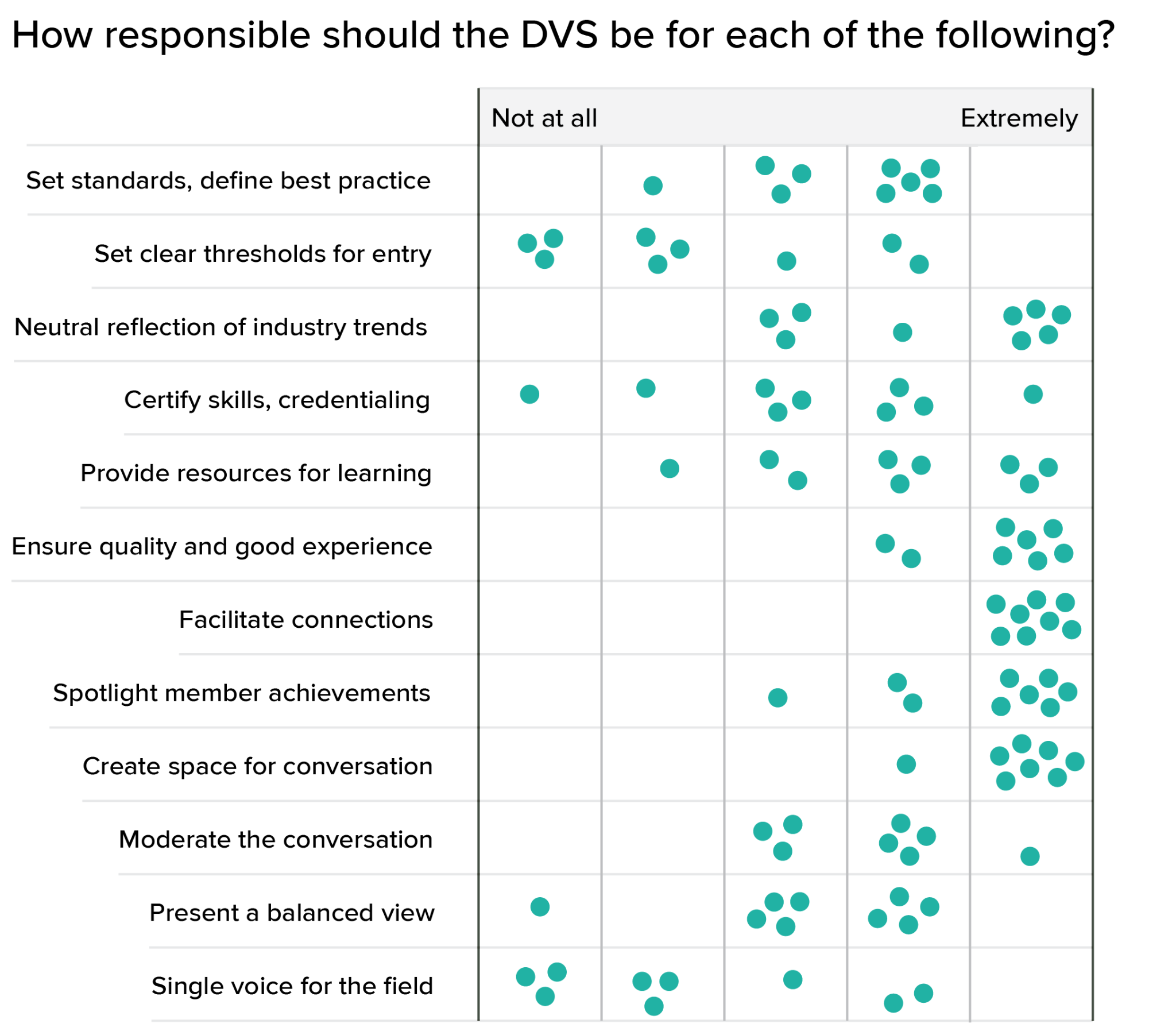
Again, it’s the range and distribution of responses that I find most interesting here. The consensus is a lot stronger in the community section of the chart than in questions about authority. In this context, identifying areas of consensus and divergence of opinion is the main point, so the distribution of answers is often more important than the average or final result.
In general, we’re not interested in being gatekeepers, but we do think that we have a role to play in creating standards for the field. We want to reflect the needs and opinions of our community more than shape them, and we feel strongly about creating an open, safe forum for conversation. We don’t want to be too heavy-handed with moderation, preferring to focus on inclusivity and balance instead. From conversations with the board, I think most moderation responsibilities fall within the category of ensuring a good experience for our members, rather than selecting a particular voice or opinion for the field.
Overall, this data gives me a really good view into what we’re trying to achieve as a board. I sent a version of the same survey out to all of our committee and advisory board members last week, and am eagerly awaiting results. Of course, we’d also like to understand how well our opinions match with yours. I’ve created a member version of the survey (linked at the end of this post), and we’d love to hear your thoughts. If you can only handle one survey right now, we’d prefer that you take the SOTI because it’s more comprehensive, but if you have thoughts on these different positioning questions, it would help to inform our discussions around these high-level priorities.
Closing the loop
All of these hypotheses are based on responses from our members, and from perspectives that the board has built in talking to our community. I’d love to know if we’ve accurately captured your interests, and where we might be missing things or simply misapplying emphasis. Please reach out if you have thoughts and opinions to share…we’re all ears. Serving the community is our primary goal, and understanding whether we’ve heard you right is the first step.
There are lots of ways to get in touch:
- Slack: I’m @Erica Gunn on Slack. Please feel free to DM me, or to tag me in threads that might be interesting/relevant. I’m not always super fast to respond, but I am interested and will get back to you.
- Email: education@datavisualizationsociety.org
- Topics in Data Viz: We will be hosting an education Topics in Data Viz in October. Keep an eye on the Announcements channel in Slack for more information, and please join in to tell us what you think!
- Join us! Do you have a background in formal survey analysis and a love for analyzing data in R? I will be expanding this data analysis through the end of the year (and thinking about what we could do next year with this year’s survey data), and would love to work with someone who has experience wrangling survey data in R. I’m looking for someone who can make a serious time commitment only, please — I expect this to be about 10 hours per week for the next couple of months, and there’s a lot riding on actually getting things done. If this sounds like you, ping me on one of the channels above!
- Positioning Survey: Respond to the positioning survey (used to create the data above) to give us your thoughts. We’d love to compare member input on these different questions to the answers we got from the board and committee/advisory council groups. This was a top request from the other board members when I showed them the data from our poll. We are listening, and interested in what you have to say (especially if your opinions are different from ours!).
- Take this year’s State of the Industry survey! Please make sure you’re counted. This is the single best way we have to get information about our membership and the community at large. If you didn’t see yourself reflected in this data analysis in some way, it’s even more important to make sure we get you this time. If you’ve already taken the survey, thank you. Please send it to a friend, and help us to make sure that everyone in the community is included!

Erica Gunn is a data visualization designer at one of the largest clinical trial data companies in the world. She creates information ecosystems that help clients to understand their data better and to access it in more intuitive and useful ways. She received her MFA in information design from Northeastern University in 2017. In a previous life, Erica was a research scientist and college chemistry professor. You can connect with her on Twitter @EricaGunn.
- Erica Gunn

- Erica Gunn

- Erica Gunn

- Erica Gunn


