
In this writing, I discuss how to use the “i want hue” web app with Viz Palette to create perceptually uniform color schemes for data visualization. The “i want hue” web app is a color suggestion system that generates and recommends color palettes for visualization. The app is based on the Hue Chroma Luminance (HCL) color model. The Viz Palette tool simulates how various types of information visualizations will look with a given color scheme. Combining the results of these tools allows you to create and analyze a customized color scheme for your data visualization projects. Let’s get started by exploring the “i want hue” user interface.
The “i want hue” Interface

Mathieu Jacomy developed the freely available “i want hue” tool to facilitate quickly building color schemes. The starting user interface to the “i want hue” web tool is shown on the left. The Color space, noted as “Default preset” on the left side of the app, is a two-dimensional cross section of the geometrically irregular Hue Chroma Luminance (HCL) color model.

There are also many other preset options from the Color space menu and I show some of these in the figure above. The “Color Blind Friendly” option is highlighted in the large detail figure with three additional presets noted as: “Red Roses”, “Green Mint” and “Indigo Night”. I found the “Color Blind Friendly” preset for generating palettes to be unreliable when I compared the results to Coblis, the Color Blindness Simulator. So, I would recommend generating color palettes with “i want hue” and using a separate tool to evaluate for color deficiency. I will discuss color deficiency in further detail in this writing.

Creating a Color Scheme by using the “Palette” functions in “i want hue”
Returning to the Default preset for Color space, it is rather straightforward to create a color scheme by using the “Palette” functions on the right side of the app. Set the number of palette colors, the default is 5, and use either the default “soft (K-means)” or “hard (Force vector)”. Let’s keep the default “soft (K-means)” setting and select “Make a palette”. The result, shown on the left, is a categorical color scheme of five distinct colors that I will call “Basic 5.” For a categorical color scheme to be effective, there should be no large variances in lightness or saturation between colors. Such variances can signify importance or preference for a particular item or grouping. Before, I use Viz Palette to apply Basic 5 to information visualization examples. Let’s examine some fundamental color theory concepts associated with the “i want hue” app.
Perceptual Uniformity
As noted previously, “i want hue” is a perceptually uniform color suggestion system. So, what does this mean? A color space is perceptually uniform if a change of length in any direction X of the color space is perceived by a human as the same change. The standard Rainbow Colormap and the traditional Red Green Blue (RGB) Color Space are non-uniform.
A non-uniform perceptual colormap can have stark contrasts when transitioning from one hue to another hue. In data visualization, these contrasts can be mistaken as changes in the data rather than as transitions in the color palette. Below, I show the difference between a non-uniform and a uniform perceptual colormap. Although I show a “Perceptual Uniform” concept in the second spectrum, the results are not a color model that can be applied consistently for visualization and design purposes.

Comparison of Non-Perceptual Uniform and Perceptual Uniform Colormaps
As noted earlier, “i want hue” is based on the Hue-Chroma-Luminance (HCL) color model that meets the uniform criterion. Below I show a comparison between the RGB and the HCL Color Wheels. The RGB Color Space has sharp variations that can be shown when converted into a Black and White depiction of the rainbow spectrum. The HCL Color Space has nearly constant transitions that show up as an almost smooth Gray spectrum when converted into a Black and White format.

What do the elements of Hue-Chroma-Luminance (HCL) refer to?
HCL uses three dimensions to describe color:
- hue (dominant wavelength)
- chroma (colorfulness, intensity of color as compared to gray)
- luminance (brightness, amount of gray)
As “i want hue” clearly depicts, the HCL color space is oddly shaped and far from geometrically regular. Some care needs to be used in designing a color suggestion system in HCL since it is possible to select an HCL color that cannot be displayed in the RGB format. This would mean the color would not appear on your display devices. Below I show my screen shots from Michael Horvath’s 3D implementations of the RGB gamut (color range) for the polarized CIE Luv and polarized CIE Lab versions of HCL. Horvath’s work appears under the free Creative Commons license and is under the Wikipedia discussion of HCL. For more details on perceptual uniformity, see my prior writing on “Color in a Perceptual Uniform Way”.

As I showed previously, “i want hue” uses two dimensional cross sections of HCL as the default user interface for building color schemes. With this background in mind, let’s return to examining the Basic 5 color scheme that “i want hue” automatically generated for me.
Applying the Basic 5 to Viz Palette:

Looking more closely at the color scheme details on the left, “i want hue” provides the Hex and RGB color notations for each color in the Basic 5 color scheme. I can use these specific numeric codes to enter the colors into Viz Palette for viewing several information visualization layouts. Elijah Meeks and Susie Lu built the freely available Viz Palette app for this purpose. The results of my entering the Basic 5 colors in Viz Palette are shown below.

Addressing Color Deficiencies in my Basic 5 Color Scheme
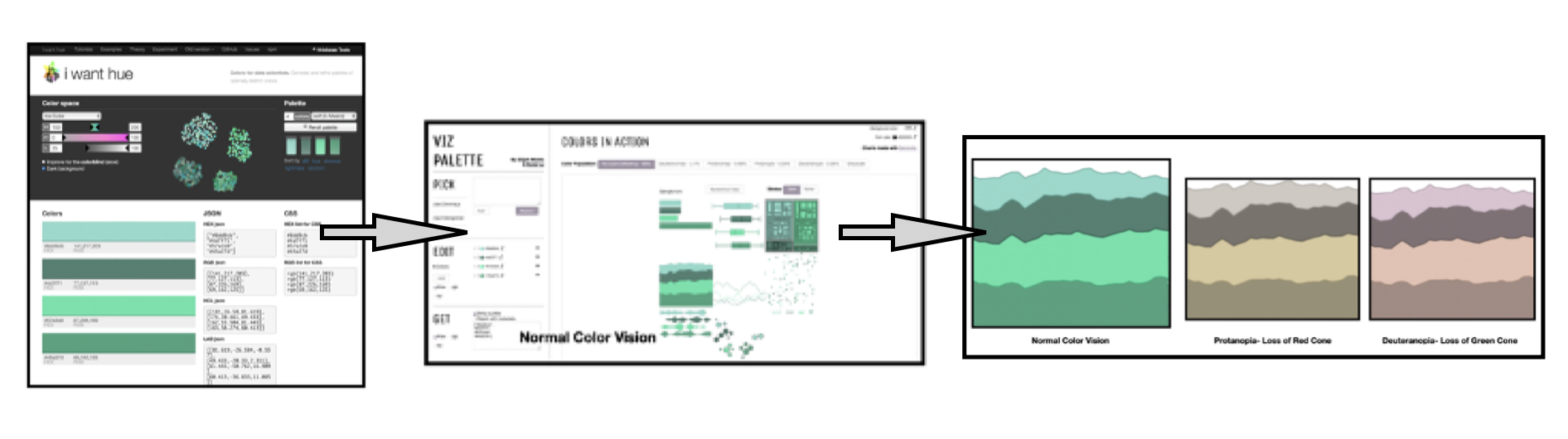
My next step is to evaluate my Basic 5 scheme for color deficiencies. Viz Palette includes options for exploring Color Deficiencies. As highlighted in my previous writings on color in data visualization, in human eyes there are three types of cone cells where each is sensitive to different parts of the visual spectrum of light. These three different cone cells combine to facilitate rich color vision. If one or more of the set of cones does not perform properly, a color deficiency results. A Red cone deficiency is classified as Protanopia. A Green cone deficiency is classified as Deuteranopia. A Blue cone deficiency is classified as Tritanopia. Viz Palette includes tests for the two more prevalent deficiencies of Protanopia and Deuteranopia. Below, I show these results from my Basic 5 Color Scheme entered into Viz Palette.

The Protanopia and Deuteranopia checks indicate the individuals with these deficiencies could have difficulty distinguishing between the Orange and Green colors in the Basic 5 palette. As noted previously, Basic 5 is a categorical color scheme with five distinct colors. It is very challenging to build a color scheme with five or more distinct colors that can pass color deficiency tests. I highlighted these concerns in my prior writing on “From Triad to Qualitative”.
If five distinct colors are needed, my approach to addressing this issue is to add text or numbers to the visualization so that the elements or categories can be referred to by: (1) colors and (2) text or numbers. To demonstrate this concept, I add text and numbers to a Basic 5 visualization from Viz Palette. Since I have stepped beyond the Viz Palette generated examples, I need to use another color deficiency tool that can evaluate the combined text, numbers and visualization image. Coblis, the Color Blindness Simulator, is designed for this purpose. Below I show the new image with the color deficiency tests from the Coblis analysis.

Exploring the Ice Cube Color Palette
As a second example, I work with the “Ice Cube” color palette to select a family of four Green colors. These are sometimes called analogous colors. I show this “i want hue” selection below and name the color scheme “Ice4”.

Using the “Ice4” hex codes, I can enter the color notations into Viz Palette to examine visualization options. These results are shown below with Viz Palette color deficiency checks for Protanopia and Deuteranopia.

Below, I show a detail of one Viz Palette example with the “Ice4” color scheme.

“Ice 4” passes the Protanopia and Deuteranopia color deficiency checks and can be safely used for further visualization examples.
Concluding Remarks
Here, I have shown how to combine the “i want hue” tool with Viz Palette to create color schemes for your data visualizations. “i want hue”s color suggestion system is based on the Hue Chroma Luminance color model. Viz Palette allows for exploring how various types of information visualizations will look with a given color scheme. The tools combined together results in a process that involves entering the color notations from an automatically generated “i want hue” color scheme into Viz Palette to view the visualization options. I also use Viz Palette to evaluate the Protanopia (Loss of Red Cone) and Deuteranopia (Loss of Green Cone) color deficiencies of the applied color scheme. A flow chart of this process for my second color theme example, “Ice4”, is shown below.

This writing provided a brief overview of the Hue Chroma Luminance color model on which “i want hue” is based. I also described how in humans there are three types of photoreceptors or cones where each is sensitive to different parts of the visual spectrum of light. If one or more of the set of cones does not perform properly, a color deficiency results. A Red cone deficiency is classified as Protanopia. A Green cone deficiency is classified as Deuteranopia. A Blue cone deficiency is classified as Tritanopia. Viz Palette includes tests for the two more prevalent deficiencies of Protanopia and Deuteranopia.
Two examples were developed. The first one used the “Default” color space to automatically select five distinct colors. I named this color scheme Basic 5. When Basic 5 was entered into Viz Palette to explore sample visualizations. The color scheme failed Protanopia and Deuteranopia color deficiency tests. To resolve this difficulty, I added text and numbers to the sample data visualization so that viewers had two channels, color and text/numbers, to classify the 5 elements of the visualization. The second example used the “Ice” color space to automatically select five colors in the Green family. My proposed color scheme named Ice4, was moved into Viz Palette and passed the Protanopia and Deuteranopia color deficiency tests.
There are many approaches to building color schemes for data visualization. This writing has focused on combining the freely available “i want hue” and Viz Palette tools to explore potential color themes for your data visualizations. For discussions on my other approaches to using color suggestions tools, please see the Medium listing of my prior Nightingale writings as well as my 2016 book on “Applying Color Theory to Digital Media and Visualization” published by CRC Press.

Theresa-Marie Rhyne is a Visualization Consultant with extensive experience in producing and colorizing digital media and visualizations. She has consulted with the Stanford University Visualization Group on a Color Suggestion Prototype System, the Center for Visualization at the University of California at Davis and the Scientific Computing and Imaging Institute at the University of Utah on applying color theory to Ensemble Data Visualization. Prior to her consulting work, she founded two visualization centers: (a) the United States Environmental Protection Agency’s Scientific Visualization Center and (b) the Center for Visualization and Analytics at North Carolina State University.
- Theresa-Marie Rhyne

- Theresa-Marie Rhyne

- Theresa-Marie Rhyne

- Theresa-Marie Rhyne


