
In May 2022, the U.S. hit the grim milestone of 1 million COVID deaths. Newsrooms across the country reported this statistic, often accompanied by sobering charts that pointed out the incomprehensible loss of life.
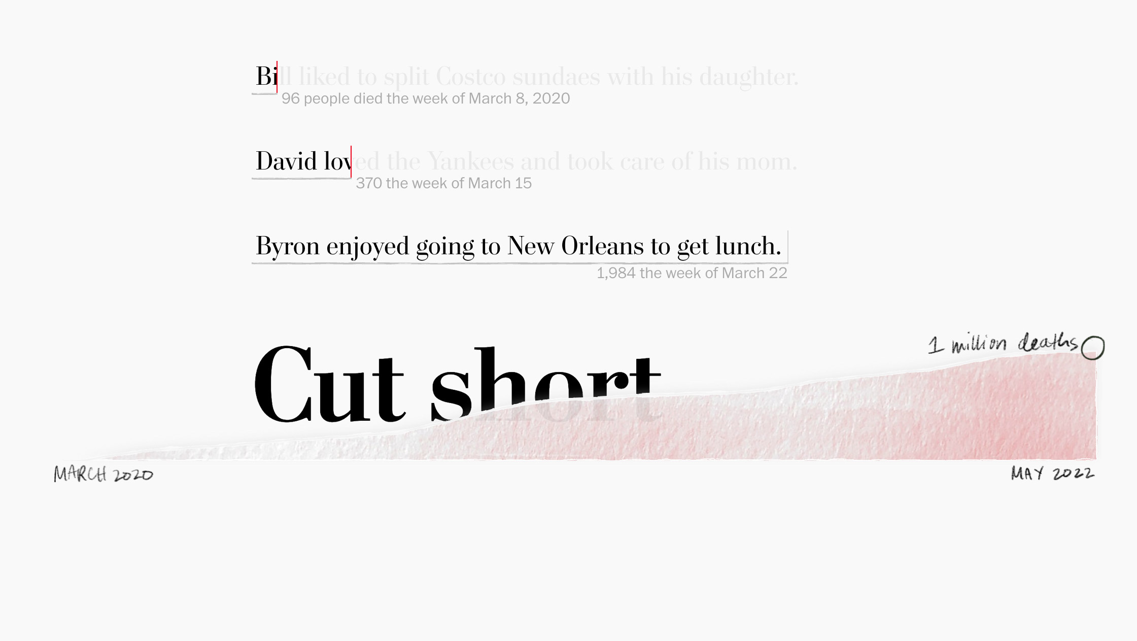
But one visualization in particular caught my eye. It was not a chart in the traditional sense, although the foundation of its form was, technically, a bar chart quantifying weekly deaths. “Cut Short” by Alyssa Fowers and Leslie Shapiro of the Washington Post reads almost like a story, introducing us to a small fraction of the 1 million individuals who died of COVID. But, unlike a story, the text cuts off abruptly. Each bar in the chart is a sentence describing the joys and hobbies of one of the many individuals lost to COVID. The sentences are cut short – literally, the text stops partway through and the rest can only be read upon hover – at a precise point along a numerical x-axis to mark how many people died of COVID that week.
It’s powerful and heartbreaking. “Richard used his last breaths to ask w—“ reads one line. To ask what? I wonder. I hover to read the complete sentence. “—to ask whether his daughter would recover from COVID-19.” I feel like someone punched me in the gut. I have to take a moment before I can keep reading.
So much of data visualization is about visualizing numbers, but the choice to emphasize qualitative data in “Cut Short” is what set it apart for me. How do you visualize a number as astronomical as 1 million, or a topic as weighty as lives lost? Alyssa agreed to chat with me about her process and the inspiration behind “Cut Short”; the following interview has been edited for clarity and brevity.
Alyssa Fowers is a graphics reporter focusing on data visualization and analysis at the Washington Post. Her work typically covers economics; she has a particular interest in thinking about how to “keep data human” while visualizing large numbers.
Claire Santoro for Nightingale: Let’s talk about “Cut Short.” How did you arrive at the idea for this piece?
Alyssa Fowers: I had been sitting on the idea since 150,000 COVID deaths, which was the first COVID memorial piece I worked on. The root of the idea comes from my best friend, who is a Wikipedia editor. He was working on an article about someone whose life extended through the 1920s and was trying to link to articles about people she knew—and he noticed that, for many, the articles stopped at 1918. They had died in the 1918 flu pandemic. Their entries were half the length of others. Seeing the shortening of life as an artifact in text struck me.
CS: How did you land on the visualization approach, sentences that are cut short to represent a bar chart of weekly Covid deaths?
AF: I honestly don’t know where the connection came from between the bar graph and the shortened text, but I knew that I wanted to try to write about people in a way that focused on what their lives were like at the time they died. I wanted to focus on what was cut short for them.
There’s this instinct when something terrible happens to try to put distance between yourself and what happened. I also noticed a tendency to ignore deaths in nursing homes or among people with disabilities. Focusing on what people liked and what they loved to do was a pushback against that: the tragedy is not necessarily that someone was going to live another 40 years and now they don’t get to; the tragedy is that they died. They lost the things that mattered to them, and the people that loved them lost them, too. That applies regardless of age, no matter what. Focusing on what people loved and wanted to do was a way to make the piece about not who they were when they were much younger or what they accomplished in their lives, but what they were losing out on doing, what they wanted to do that now they will never get to do.

CS: Tell us about the data you were working with—because, interestingly, unlike many of the visualizations we see in the news, you worked with both quantitative and qualitative data.
AF: When I first came up with the idea, I had no idea how we would get the data. I knew I wanted to highlight one person per week, because COVID charts are often presented by week, and also because of the physical considerations—how long the chart would be with one line per day and how short it would be with one per month.
Early in the pandemic, the Post had a reader submission form asking people to share if they had lost a loved one. When I was working on the memorial piece for the milestone of 150,000 deaths in July 2020, I thought I could probably find one person from each week of the pandemic just from those reader submissions. But people had largely stopped responding to the submission form by 2022, and I could only find a few people from that source.
So, one of the editors suggested searching legacy.com or another obituary aggregator. Legacy.com allows you to search by keyword and using Booleans, so that was where I wound up collecting the data.
It took a really long time. I think I spent two weeks reading obituaries for eight hours a day.
I found between 400-500 obituaries that matched my initial criteria. Then, I had to match them to specific weeks and to the population of people who died in the U.S. The distribution of people we highlight is roughly representative of all Americans who died of COVID in terms of age, sex, race, and ethnicity. There are other areas where we weren’t able to ensure a representative sample, in part because the information wasn’t available. For example, we were trying to look for people who were living in institutional settings, like nursing homes or inpatient mental health facilities, but obituaries don’t always say what someone’s circumstances were.
The other side of data collection was that, as I was writing the sentences, I was trying to get in contact with as many of the families as I could. There were 114 of them! I wound up contacting all the funeral homes, churches, whatever institutions were mentioned in the obituary. I asked those institutions to pass along my message to the families, to let them know that I was including information about their family member in my story and to give them a chance to ask me questions. And, of course, if they did get in touch with me, to fact check.
There was one situation that broke my heart, where I had written about something that a woman had done in her much younger years. Her daughter wrote to me and said, essentially, “That hadn’t happened for more than a decade. She was in really frail health; she didn’t do much; she had advanced dementia.” She said she understood if I no longer wanted to include her mother in the project. But my response was, “No, that is exactly why I’m doing this.” And I asked her what her mother did enjoy. What had brought her happiness, no matter how small? (Her daughter’s answer: “Flowers.”)
I did my best to get in touch with as many people as possible. I think I talked to 35 families over the course of a couple of weeks. What I found was that, as long as I was willing to listen, people wanted to talk. It was intense, but I feel lucky that I was able to connect with so many families and get to know their loved ones a little bit.
CS: Wow, that’s powerful. I didn’t realize you had been in contact with the families.
AF: Yeah. I couldn’t help thinking, if I had lost someone in this way and then stumbled on a story that talked about them and I had no idea… I would never want anyone to have that experience.
CS: Let’s talk about the design. How did the final form take shape?
AF: I teamed up with Leslie Shapiro, who is an incredible designer/developer/reporter. She did 100% of the development for this project and added cool interactive elements and animation, like the line chart along the bottom and underlines beneath the text.
We experimented with a number of ways to present the data. The original idea was a single vertical bar chart, essentially a big text box with the lines cut off. That would have been great as a print graphic, but it wouldn’t work well online.
In the original conception it was, as you see it now, a sentence cut off, with the length determined by the number of people who died. But we also thought about the inverse—maybe you want to read more about a person on weeks with less death? We tried a bunch of things, but most people seemed to get it more quickly the way we have it now.

CS: As a data journalist, how do you think about when to use less conventional visualization approaches like “Cut Short” vs. more traditional and familiar chart types?
AF: It really depends on the project. With this one, what I wanted to communicate was a sense of abrupt ending where things shouldn’t have ended—you know, that gut punch feeling. And, for that, I knew the visualization could not be conventional. When the goal is to have people think about data in a way that is not how they’ve thought about it before, or to instill a particular emotion, or to personalize the data, standard charts are probably not going to work. On the other hand, if I want to convey something with intense precision, or if I want a chart to be immediately readable, I go with a standard chart type.

CS: Let’s back up and talk about your background. A core part of the DVS mission is encouraging people who want to get into data viz. What was your path to data viz?
AF: It’s very twisty!
I did my undergrad in research psychology with the intent to be a professor. Part of doing research was analyzing my own data, so that was a skill set I developed on the side. I got into a couple of PhD programs, went to tour the schools, and just had this choking feeling like, “No, I can’t do this right now.” But I realized that I had a basic set of analysis skills so, very boldly, I branded myself as a data analyst, and I got an analysis job.
Eventually, I switched to working at a nonprofit, and I went to a conference. I overslept the first day and almost missed the keynote. So I walked in late to a presentation that Alberto Cairo was giving about data journalism and infographic design. I walked in and sat down in the back of the room, and he put up infographics on the screen, and I felt this sudden pull of, “That’s what I want to do! That’s it. That’s the thing.” I’m so glad I didn’t skip that keynote.
After that, I taught myself basic data visualization with ggplot. I started thinking that if I wanted a job communicating data on a large scale, I should try to learn more about statistics, so I chose to go to grad school at the University of Miami because they had a good research and methods program in their School of Education… and they also had Alberto Cairo. After my first year in the PhD program, I realized I really just wanted to do viz stuff, so I made the decision to switch from a fully funded PhD in statistics to a self-paid MFA in interactive multimedia, which I do not regret one bit, but which was definitely a weird thing to do! From there, I really got to dive into the stuff that I loved.
Then, how I got to the Post: I applied for a summer internship on the graphics team, but I didn’t get it. But when the team needed somebody to fill in for a person on parental leave, I was offered a contract job. I thought I’d take a semester off to work at the Post for a while, but that was January 2020, and when the pandemic hit, things started moving a little faster for me. I was able to use the skills I had, the subject matter knowledge in economics that I had. I learned about non-blog writing, how to frame a story, how to do interviews. My contract got extended a couple of times, they opened new staff positions, I applied for a job, and I’ve been doing it ever since.
CS: What tips do you have for aspiring data journalists?
AF: I would say if you want to get into it, get into it. I think people’s instinct is often to jump into classes or grad school immediately, but the most important thing is to find something that you care about and work on it. You can learn so much more by working your way through real issues. The first passion project I did was about characters’ speaking time in a podcast I loved at the time. I found the scripts and hand-collected this dataset, and the visualization I came up with was completely impenetrable. I would never show it to anyone now! But I learned the most from doing that.
Practice is really important. You will find your style and find your voice, and you’ll be able to not only write on your resume that you know how to do something, but you can say, go look at it.
The other thing that is really important is making sure you’re thinking through what you’re doing and why. The subject matter you work with will change over time, especially if you’re a reporter. The specific tools you use will change over time, depending on what your employer wants you to use. But the way you think about things and think through things—that’s portable. You can apply that no matter what.
Claire Santoro is an information designer with a passion for energy and sustainability. For 10 years, Claire has worked with governmental agencies, non-profit organizations, and higher education to accelerate climate action by communicating complex information in an engaging, approachable way. Claire holds an M.S. in environmental science from the University of Michigan.
- Claire Santoro

- Claire Santoro

- Claire Santoro

- Claire Santoro


