
In this writing, I discuss how to build fresh color schemes from a vintage visualization. I use a bubble chart created in the 1890s as my source and Adobe Color to help me revitalize the color palette. I then apply the revitalized color scheme to data by using my five-stage process for colorizing a data visualization. During the colorizing process, I discover an alternative color scheme that more closely matches the theme of the data sets. Let’s get started by looking at the vintage visualization and analyzing its color scheme with Adobe Color.
The vintage visualization

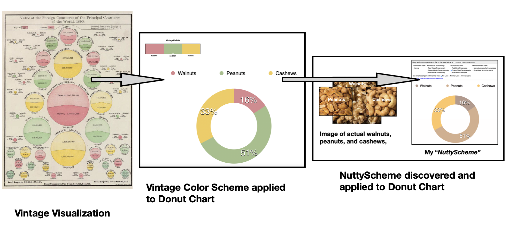
The bubble chart visualization shown above depicts the “Value of the Foreign Commerce of the Principal Countries of the World, 1890” and appeared in Rand, McNally & Co.’s 1892 publication of an indexed atlas of the world. I discovered this visualization while browsing through the Stanford Libraries’ online collection and followed a link to Princeton University’s brief discussion of the “Rand, McNally & Co.’s Indexed atlas of the world map of the world on Mercator’s projection”. Unfortunately, I was not able to find a discussion on the details of the design and creator of this wonderful visualization.
Importing the visualization into Adobe Color
Adobe Color is a free online color suggestion and analysis tool for building color schemes. I can use its “Extract Theme” function to import an image of the vintage bubble chart. Adobe Color automatically extracts a five color Pink, Green, Yellow, Cream and vintage White “theme”. Adobe Color uses the terminology of “Color Theme” to indicate a Color Scheme. Below, I show the results of the initial analysis Adobe Color performed.

I next reposition the five color sensors that Adobe Color provides for building its color theme. My repositioning includes the Black text color and the vintage White background color with the Pink, Green and Yellow elements of the bubble chart. These results are shown below.

I save the color theme as “VintageFiz” in Adobe Color and click on the Color Wheel option to examine the color elements in more detail. These results are shown below.

I decide to apply the Pink #D9898F, Green #A4BF8A, and Yellow #F2CB57 color elements to data visualization and call the resulting color scheme VintageFizPGY. I show these results below.

My five-stage process for colorizing a data visualization
In a previous Nightingale writing, I defined and diagrammed a “Process of Colorizing a Data Visualization”. These steps, with my ring diagram are noted below:

- Establish data classes for visualization and key color for visualization;
- Select color rule, color harmony per criteria of your data;
- Build color scheme. A color suggestion tool might be helpful;
- Check and revise due to color deficiency, contrasts, or any pre-existing conditions;
- Apply color theme to data visualization. Some modifications might result.
The concept was inspired by a technical discussion that I wrote with Georges Hattab and Dominik Heider on “Ten simple rules to colorize biological data visualization”.
Let’s proceed with applying my VintageFizPGY color theme to data visualization according to these five steps.
1) Establish data classes for visualization and key color for visualization:
VIntageFizPGY has three color elements to support three data classes for data visualization. For now, let’s not define a specific key color. I will explain this further in Step #2.
2) Select color rule, color harmony per criteria of your data:
VIntageFizPGY is an example of a three-class qualitative color scheme for data visualization. Each color receives equal perceptual weight so there are three key colors. Below, I show how VIntageFizPGY compares to similar qualitative color schemes found in the ColorBrewer color suggestion system.

3) Build color scheme. A color suggestion tool might be helpful:Previously, I used Adobe Color to help me extract the colors of VIntageFiz from an historic visualization. Let’s continue to use this tool and look again in more detail at the three colors that compose VIntageFizPGY. I show these results below.

In step #4, I will use the “Accessibility Tools” function in Adobe Color to perform preliminary color deficiency checks of the VintageFiz and VintageFizPGY color scheme. With this transition to step #4, let’s first define color deficiencies.
4) Check and revise due to color deficiency, contrasts, or any pre-existing conditions:
As highlighted in my previous writings on color in data visualization, in human eyes there are three types of cone cells where each is sensitive to different parts of the visual spectrum of light. These three different cone cells combine to facilitate rich color vision. If one or more of the set of cones does not perform properly, a color deficiency results. A Red cone deficiency is classified as Protanopia. A Green cone deficiency is classified as Deuteranopia. A Blue cone deficiency is classified as Tritanopia.
Adobe Color provides “Accessibility Tools” to evaluate if its color themes are “Color Blind” safe for Deuteranopia, Protanopia, and Tritanopia. If the color theme fails these color deficiency checks, Adobe Color provides suggestions for repositioning its color sensors to pass these accessibility tests. Below, I show the results from Adobe Color’s color deficiency tests for VintageFiz.

5) Apply color theme to data visualization. Some modifications might result:
My data set is a categorical one of the percentage of peanuts, cashews and walnuts in my pantry. I select a donut visualization, using the VintageFizPGY color scheme, to depict the quantities. These results are shown below.

To be sure of color deficiency, I perform a final check of my donut visualization using the freely available Color Blindness Simulator (Coblis) tool. The checks for the donut chart with the VintageFizPGY color scheme indicate that individuals with color deficiencies can distinguish three distinct colors. These results are shown below. I have successfully applied the VintageFizPGY color scheme to a data visualization.

An alternative visualization
Upon review of the color deficiency tests, I notice that the Deuteranopia check provides a color scheme in the multi hue Brown range. This color scheme is an appropriate match for a categorical visualization of peanuts, walnuts, and cashews in my pantry. Below, I show a more detailed view of what I call the “NuttyScheme” with a color comparison of images of actual walnuts, peanuts and cashews.

I then determine the colors of my “NuttyScheme” by using the “Extract Theme” function in Adobe Color. I show these results below.

Now, I can work with the actual Hex codes of the color in the NuttyScheme. I show a detail of this color scheme below.

I can now apply NuttyScheme to the donut visualization of the percentage of peanuts, cashews, and walnuts in my pantry. These results are shown below.

To be thorough in regard to color deficiency, I perform final Coblis checks of my donut visualization with the NuttyScheme applied. Happily, the visualization passes color deficiency checks and NuttyScheme is successfully applied to the donut chart. These results are shown below.

Concluding remarks
In this writing, I have shown how to extract colors from vintage visualizations and apply the resulting color schemes to your data visualization work. My source was a bubble chart created in the 1890s. I used Adobe Color to extract Pink #D9898F, Green #A4BF8A, and Yellow #F2CB57 color elements and named the color scheme VintageFizPGY. Using my five-stage process for colorizing a data visualization, I successfully applied VintageFizPGY to a donut chart of the percentage of Peanuts, Cashews and Walnuts in my pantry. During the colorization process, I discovered that the Deuteranopia color deficiency check of VintageFizPG produced a color scheme that more closely matched the theme of categorizing different types of nuts. I decided to explore this color scheme possibility further. Using Adobe Color, I was able to establish Hex codes associated with the three colors in the Deuteranopia color deficiency check. I named this new color combination NuttyScheme and applied it to my donut chart. The NuttyScheme visualization passed color deficiency checks. As a result, my vintage visualization helped me to discover two fresh color scheme alternatives for my categorical data visualization. I show a simplified flow chart of my efforts below.

There are many ways to approach building color schemes for data visualization. I have shown a specific method here. For further discussion on my approaches with other color suggestion tools, please see my prior Nightingale articles as well as my 2016 book on Applying Color Theory to Digital Media and Visualization published by CRC Press.

Theresa-Marie Rhyne is a Visualization Consultant with extensive experience in producing and colorizing digital media and visualizations. She has consulted with the Stanford University Visualization Group on a Color Suggestion Prototype System, the Center for Visualization at the University of California at Davis and the Scientific Computing and Imaging Institute at the University of Utah on applying color theory to Ensemble Data Visualization. Prior to her consulting work, she founded two visualization centers: (a) the United States Environmental Protection Agency’s Scientific Visualization Center and (b) the Center for Visualization and Analytics at North Carolina State University.
- Theresa-Marie Rhyne

- Theresa-Marie Rhyne

- Theresa-Marie Rhyne

- Theresa-Marie Rhyne


