
I was excited to read and review Questions in Dataviz by Neil Richards, because I love the idea of data visualization design driven by questions. I think the more we can question our data and our dataviz practices, the better our communication of data will become. As the title suggests, the book is an exploration of different dataviz questions (26 to be exact) organized into three different sections: First Questions, Challenging Questions, and Idea Questions.
I also had the pleasure of speaking with Neil over a video interview about the book and his process of creating it. Through the interview, Neil shared that the origins of the book are in the blog he started as a way to explore and have fun with data visualization, questioning ideas as he went. Through the book, Neil wants readers to come up with their own conclusions, rather than presenting specific best practices.

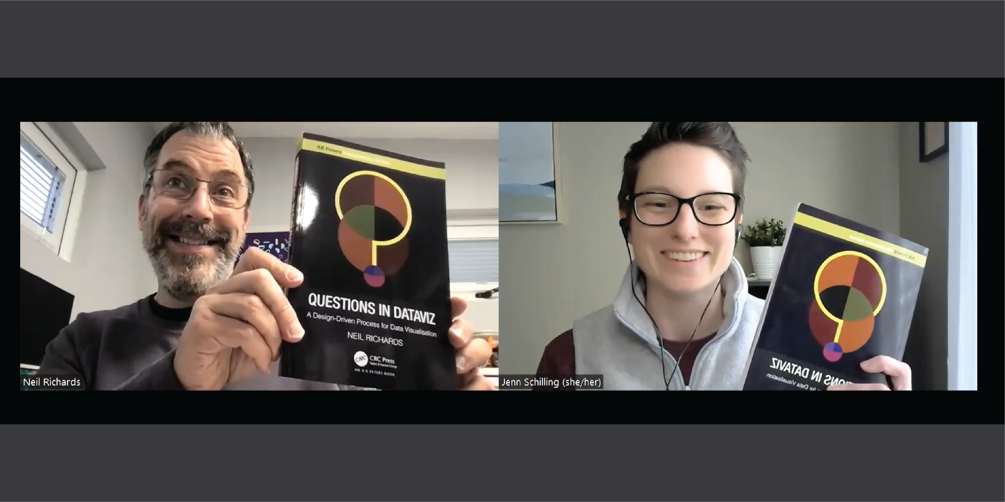
When I first received the book, I enjoyed the visualization right on its cover. The cover was designed by Alli Torban, and the spine of the book is a stacked bar showing the proportion of each color in the cover image – how cool is that?
In our interview, Neil shared that Alli’s first design was spot on and the one that ended up as the cover. Once he had the design, Neil used the logo as the brand for the book and the promotion of it. You can read more about the process of creating the cover on Neil’s blog.

There’s another dataviz down the page edges of the book too! Each of the three sections of the book uses a different color for its headings, and these colors are also used as “tabs” on the edge of each page in the section. This forms a neat dataviz across the page edges, showing how large each section is – section one is the shortest while section three is the longest.

The book contains a large number of examples of dataviz, in a variety of styles, all rendered in high quality images. After reading the book, I can confirm my initial impression that this is both a book you could read all in one go or use as a reference to pick up and explore a specific question.
In our interview, I asked Neil the challenging question to pick his favorite dataviz from his hobby work. He talked about how he creates visualizations with himself as the audience when doing it for fun, and brought up his visualization of repeating numbers in the decimal representations of fractions, which ended up as a poster in a mathematics classroom! When designing the visualization, Neil was thinking about math posters, so it was an exciting moment when it ended up in an actual classroom. Neil gets the most enjoyment out of creating dataviz when he is using a dataset of particular interest (for example, 1980s number one singles) and finds the process fun.
I really appreciated the book’s focus on the creative process and enjoyment of dataviz. Most of the examples in the book are from Neil’s own dataviz hobby work, rather than business visualizations. As someone who does dataviz both for fun and work, I enjoyed the exploration of the intersections of those practices and the focus on more unconventional dataviz. In the introduction, Neil encourages the reader to view the book as a journey rather than a set of principles, which I found quite refreshing.
While the focus of the book is not on providing guidelines and principles, the first section does explore some principles that provide a strong foundation for a dataviz practice by encouraging the reader to let data drive chart choices, providing color best practices, and reviewing the Gestalt principles. This brief examination of foundational principles serves as a grounding introduction to the rest of the book. I particularly enjoyed the chapter “Do data visualizations have to tell a story?” because of its exploration of what it actually means to tell a story with data and if we even should be telling stories with data. I like the way Neil examines the nuances of the questions he asks in this book.
In the second section, I really appreciated Neil’s investigation of the reasons why we visualize data. Yes, we visualize data to help others and ourselves understand, explore, learn, and discover. But we can also do it just for fun and enjoyment of the practice. My favorite chapter in this section was “What is data humanism?”, and I felt that this section began the exploration of the creative practice of dataviz.
The third and final section expands on this creative practice. I liked both Neil’s encouragement to the reader to experiment with different types of dataviz and the thought that it’s alright and sometimes preferable for it to take the audience time to interpret and understand a dataviz. In a world focused on rapid insights and quick interpretations, I thought this was a helpful step back. I found the chapters “Can you create visualizations using only numbers?” and “How do you visualize music?” particularly inspiring.
There are only two qualms I have with this book. First, I take slight issue with the inclusion of the Nigel Holmes diamond visualization in the last chapter of section one that discusses empty space in a visualization. While this is a memorable image – and certainly a central one to the chartjunk debate – I find its sexualization and stereotyping of women problematic, and I think the same point could have been made with a chart that was equally memorable but without the sexist imagery.
I asked Neil about the choice to include this image in the book in our interview, and he explained that it’s the dataviz critiqued by Tufte in his book Envisioning Information. So to introduce the chartjunk conversation, Neil used the same image. In our interview, Neil acknowledged that in the present day (40 years since the original image was produced), he would visualize it differently. But in terms of impact and memorability (and to introduce the debate on empty space), he selected the same image Tufte used to start with.
Second, in the chapter “What are Data Portraits?” Neil provides a recreation of W.E.B. Du Bois’s City and Rural Population visualization. This recreation focuses on palm oil production and its impact on orangutans, and the discussion of the recreation includes the consideration of adding an image of an ape to the dataviz. I agree with Neil’s valid inclination not to represent himself as anything other than his “privileged white male” (p. 232) identities. However, I think it is precisely because of that privilege that he has a larger voice and a responsibility to point out oppression and white supremacy in society. Certainly data around race needs to be treated with care, but I find the choice to recreate Du Bois’s work with a topic related to primates rather than current data on inequality somewhat problematic and a missed opportunity.
I also asked Neil about this choice in our interview, he explained that he focused on the recreation of the design more than the subject of the dataviz. To this end, Neil looked for a completely different dataset with four values and one number much larger than the other three to recreate Du Bois’s work in his own way. Neil also explained that he has done environmental campaigning around palm oil and visited Indonesia to see the plight of orangutans in the past, which he has never had the opportunity to visualize before. So, he decided on that topic and data for the recreation and focused on matching the design of Du Bois’s original work.
Despite these two minor issues, I think that Questions in Dataviz provides a compelling journey through dataviz practices and examples. I enjoyed reading this book and spent quite a bit of time examining the variety of visualization examples provided. I am also really grateful to have had the opportunity to speak with Neil about the book and his process.
The last question I asked in our interview was about his favorite chapter in the book. Neil’s response: “What’s in a color?” in section one, “Why do we visualize using triangles?” in section two, and “Why do I use flowers to visualize data?” in section three. Because the book is based on Neil’s own experience and personal dataviz exploration, he enjoys all the chapters – if he didn’t think it was fun, he didn’t put it in the book.
While Questions in Dataviz poses many questions, Neil is clear in his intent to provide exploration and discussion rather than answers. He encourages the reader to make their own conclusions and consider the nuance within each question. Overall, I think this is a highly effective book that certainly inspired me to try some new things in my own data visualization practice.
Pick up your own copy of Neil’s book today!
Disclaimer: Some of the links in this post are Amazon Affiliate links. This means that if you click on the link and make a purchase, we may receive a small commission at no extra cost to you. Thank you for your support!

Jenn Schilling is the founder of Schilling Data Studio, a data visualization training and consulting agency. She has a decade of experience applying data science and data visualization in a variety of industries, including supply chain, market research, and higher education. Jenn loves telling compelling stories with data and teaching others how to create impactful visualizations.
- Jenn Schilling

- Jenn Schilling

- Jenn Schilling

- Jenn Schilling


